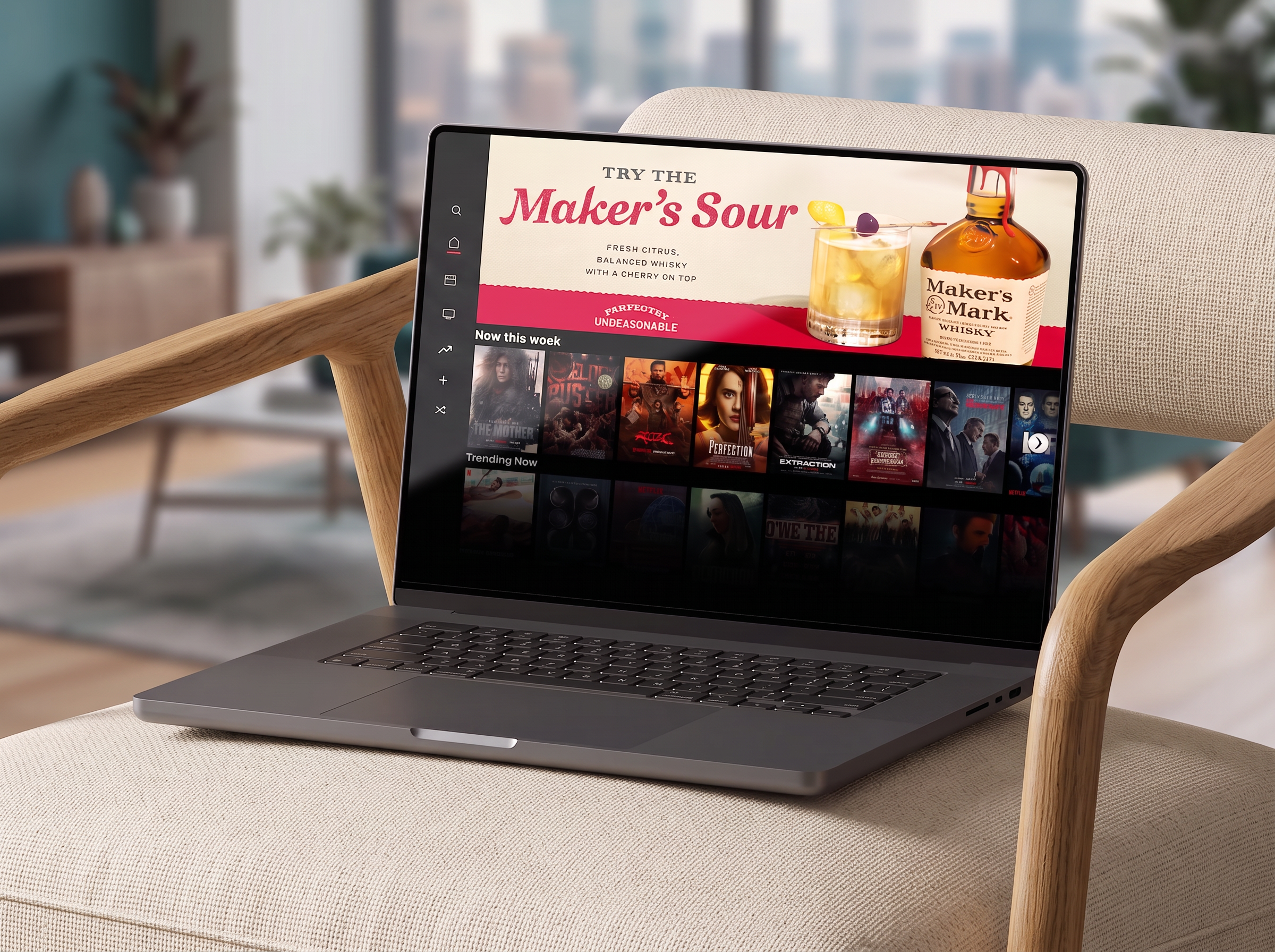
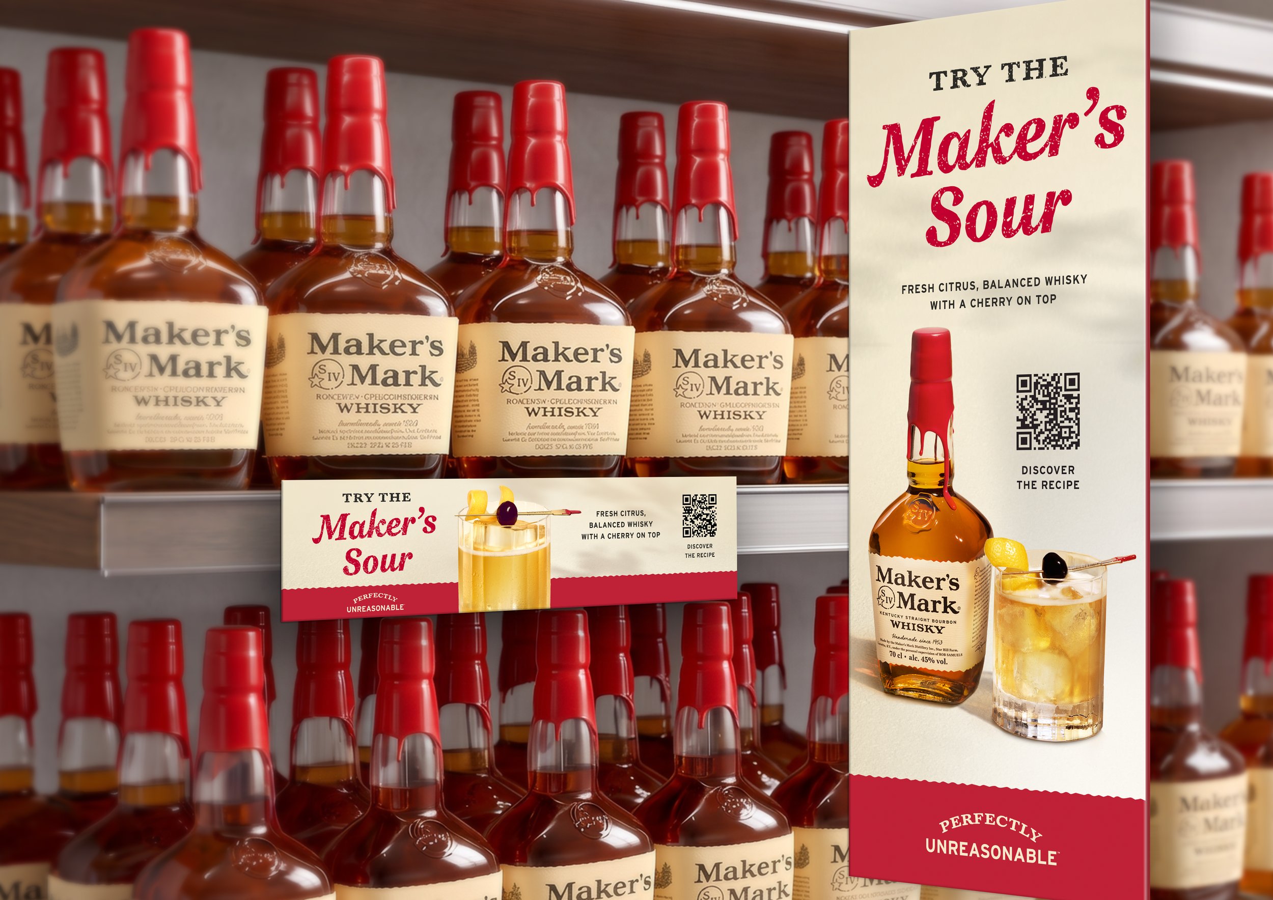
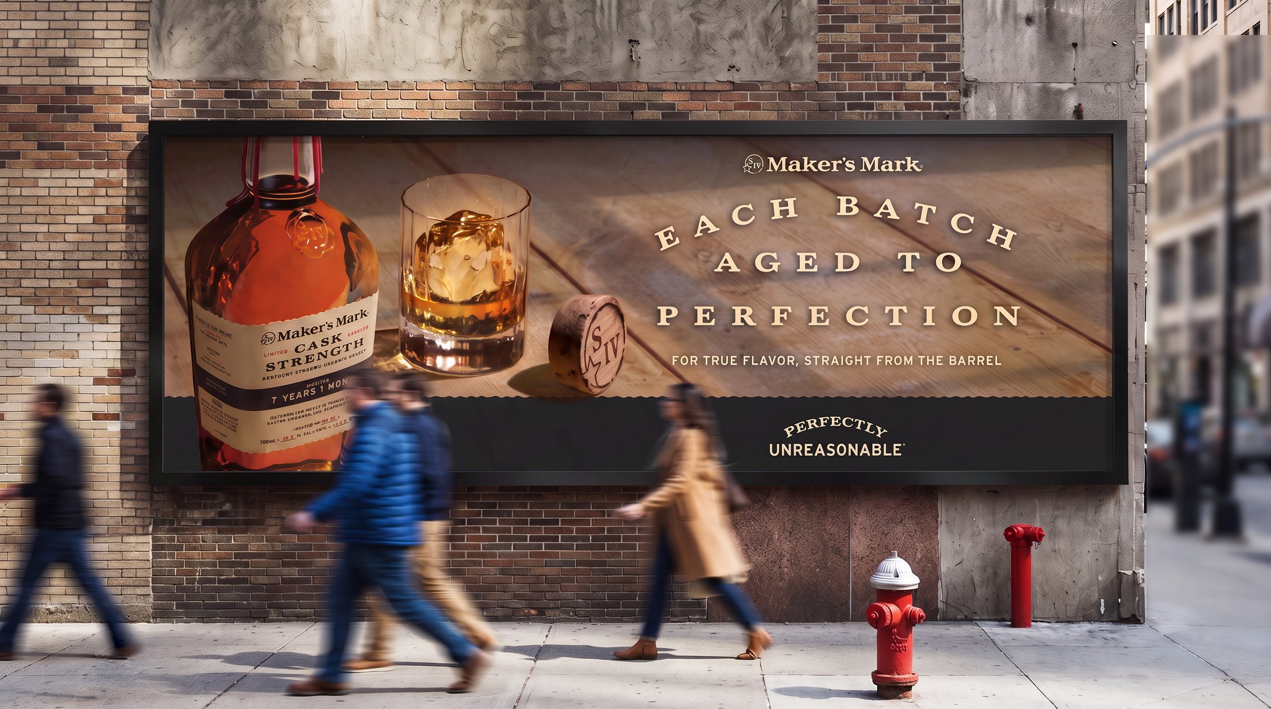
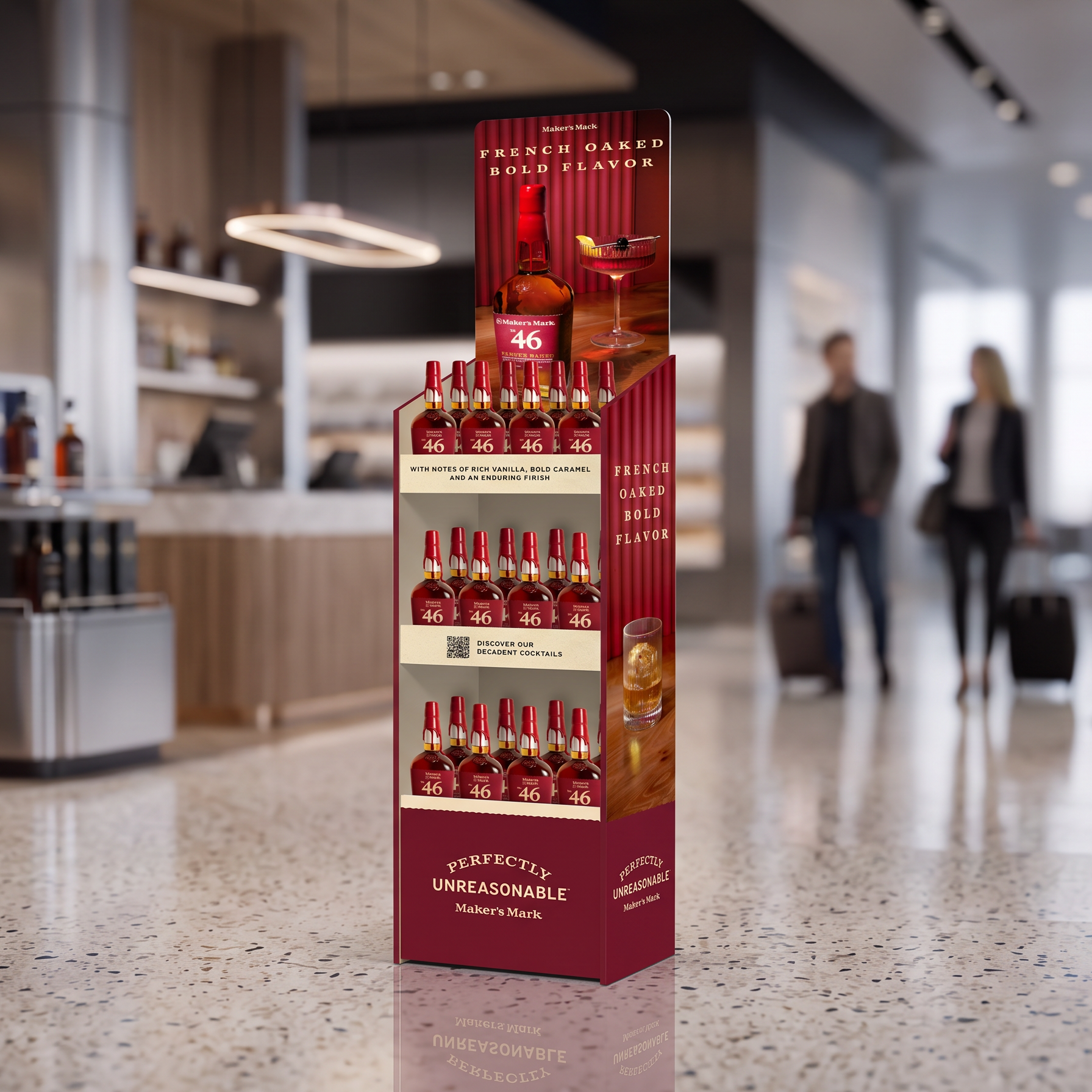
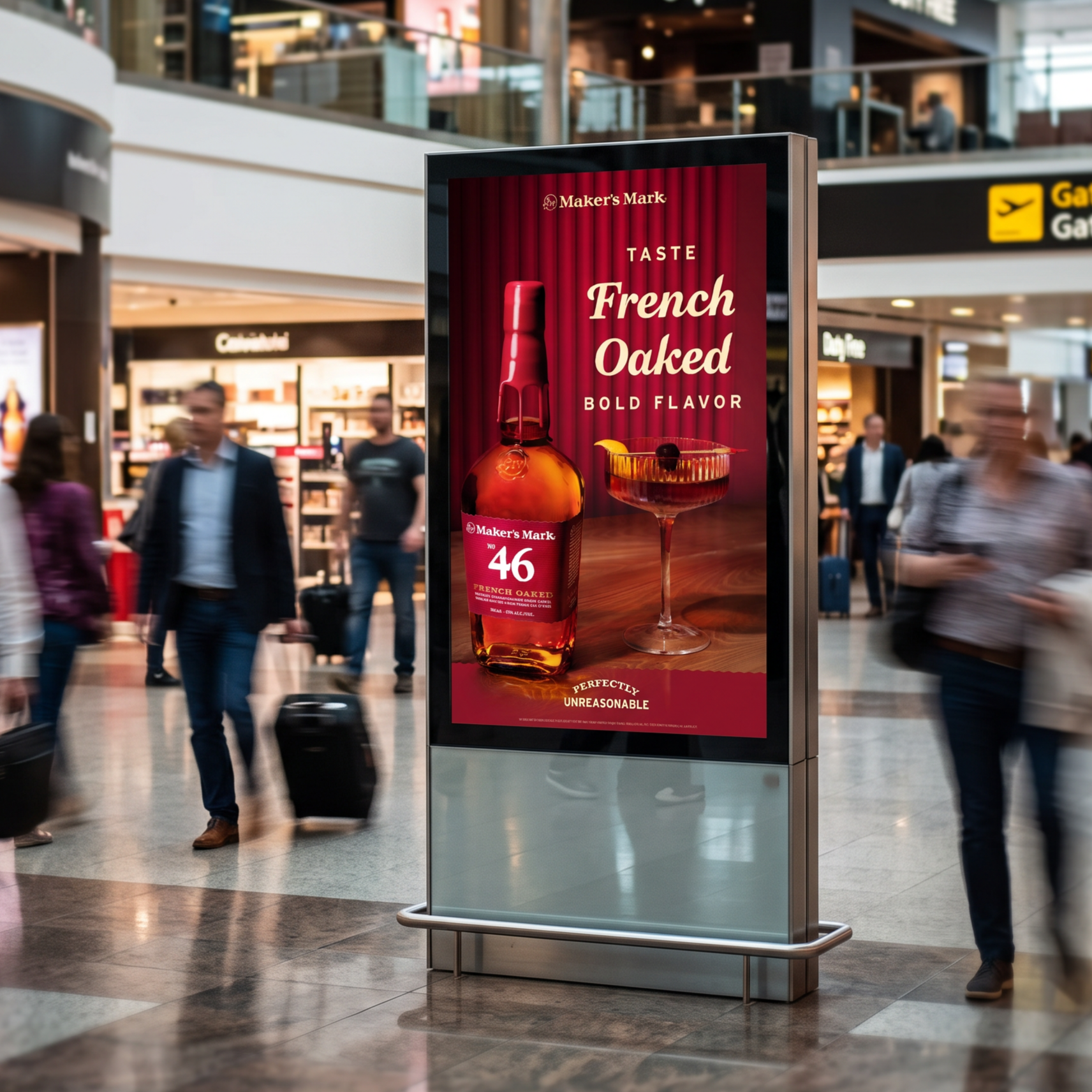
Maker's Mark set out to redefine its global visual language across core whiskey expressions.
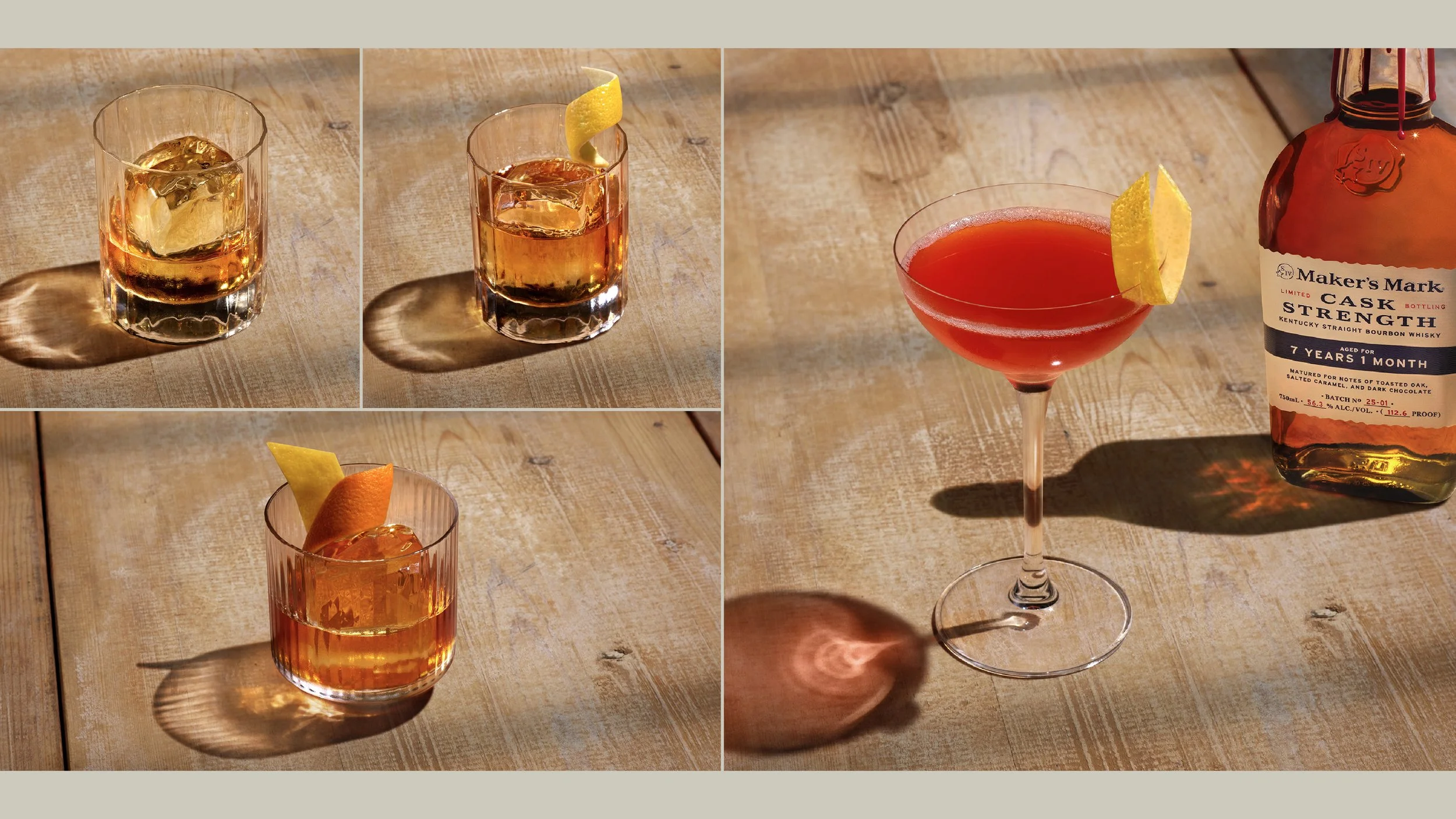
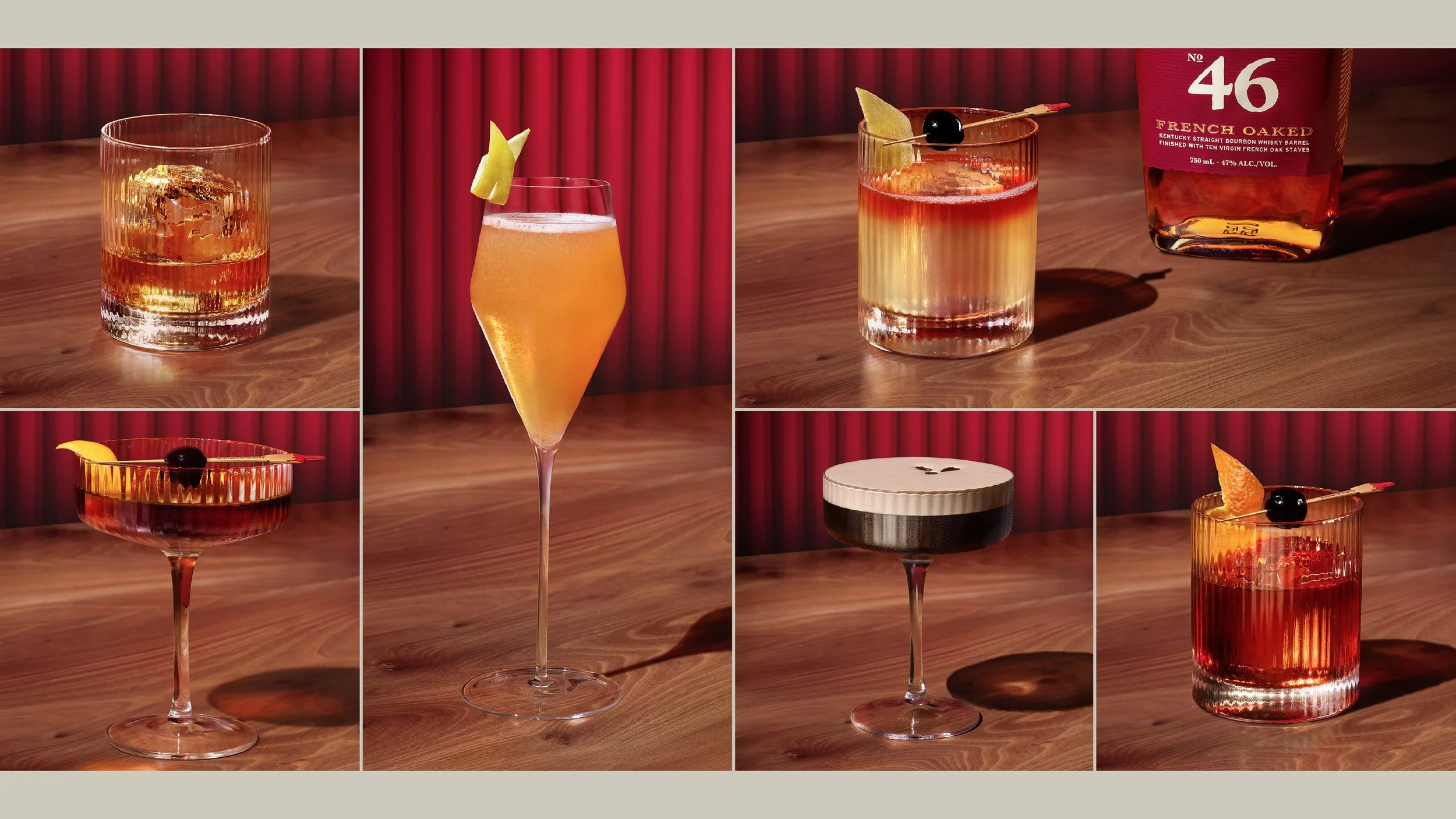
The challenge was to build a scalable system that clearly differentiated Classic, Cask Strength, and 46 through a distinct visual identity for each SKU.
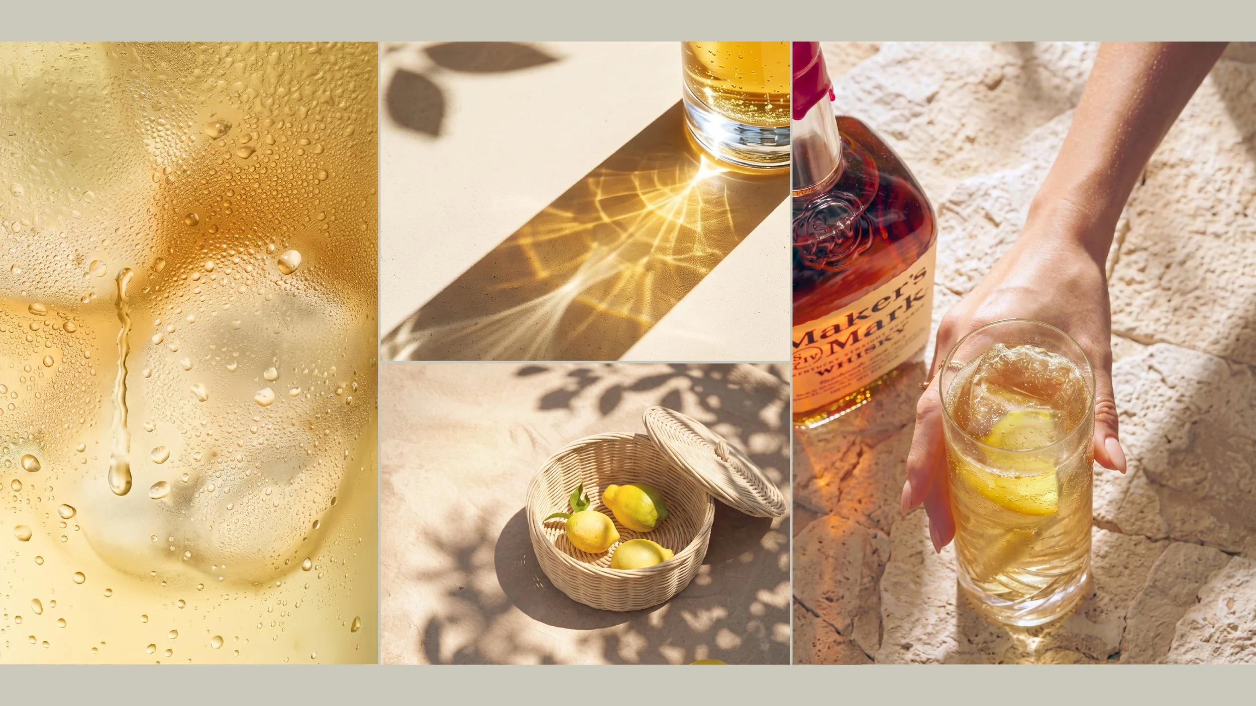
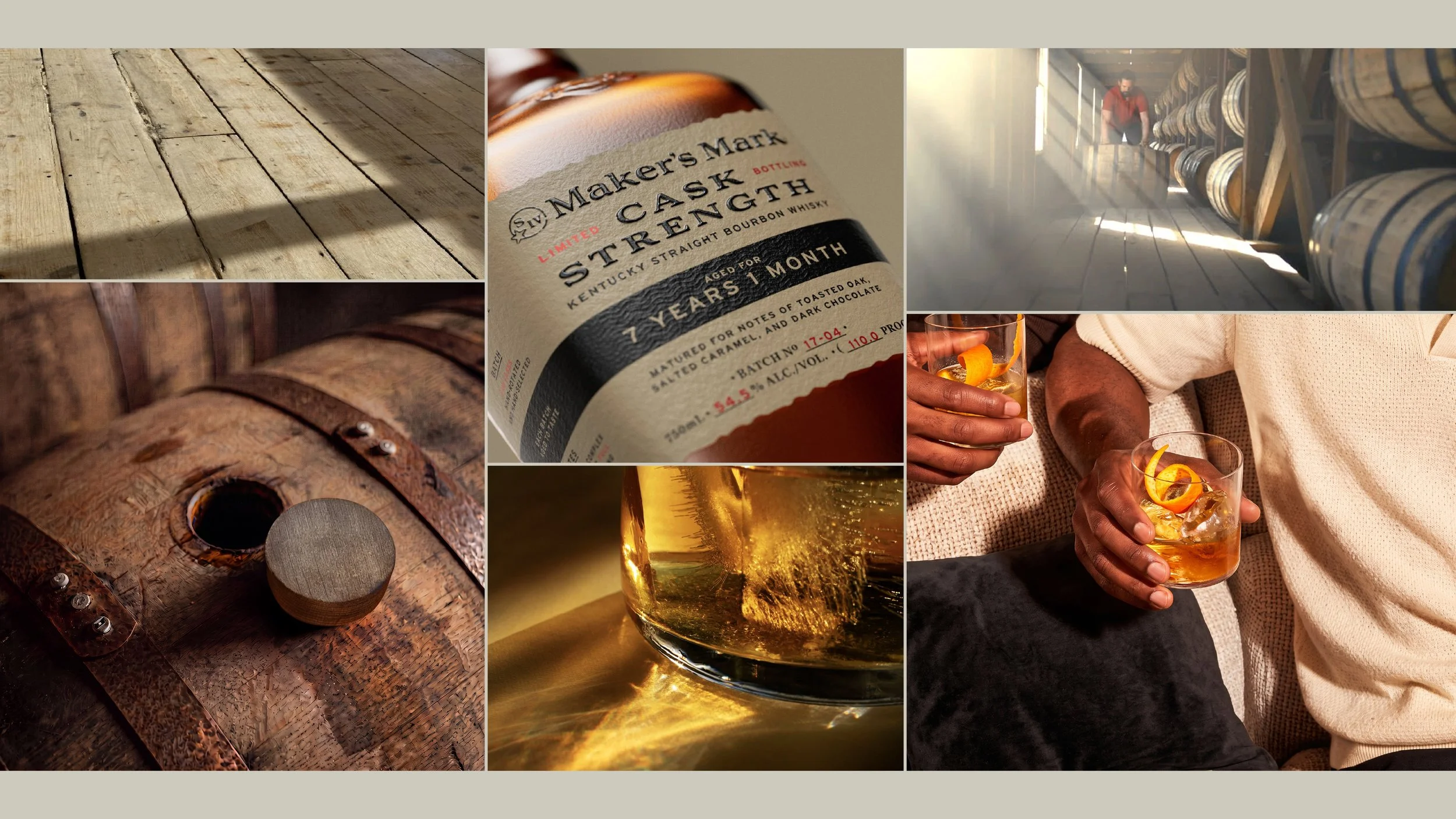
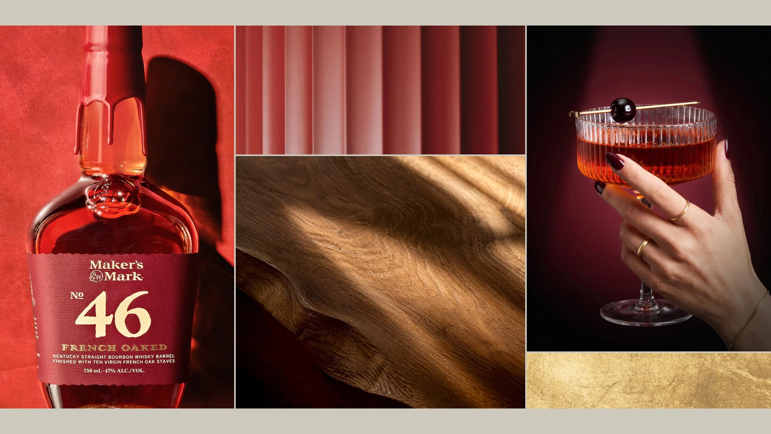
My role as designer at Wonderworks was to lead the creative development of the visual language, defining mood boards, colour palettes, and key visual concepts.
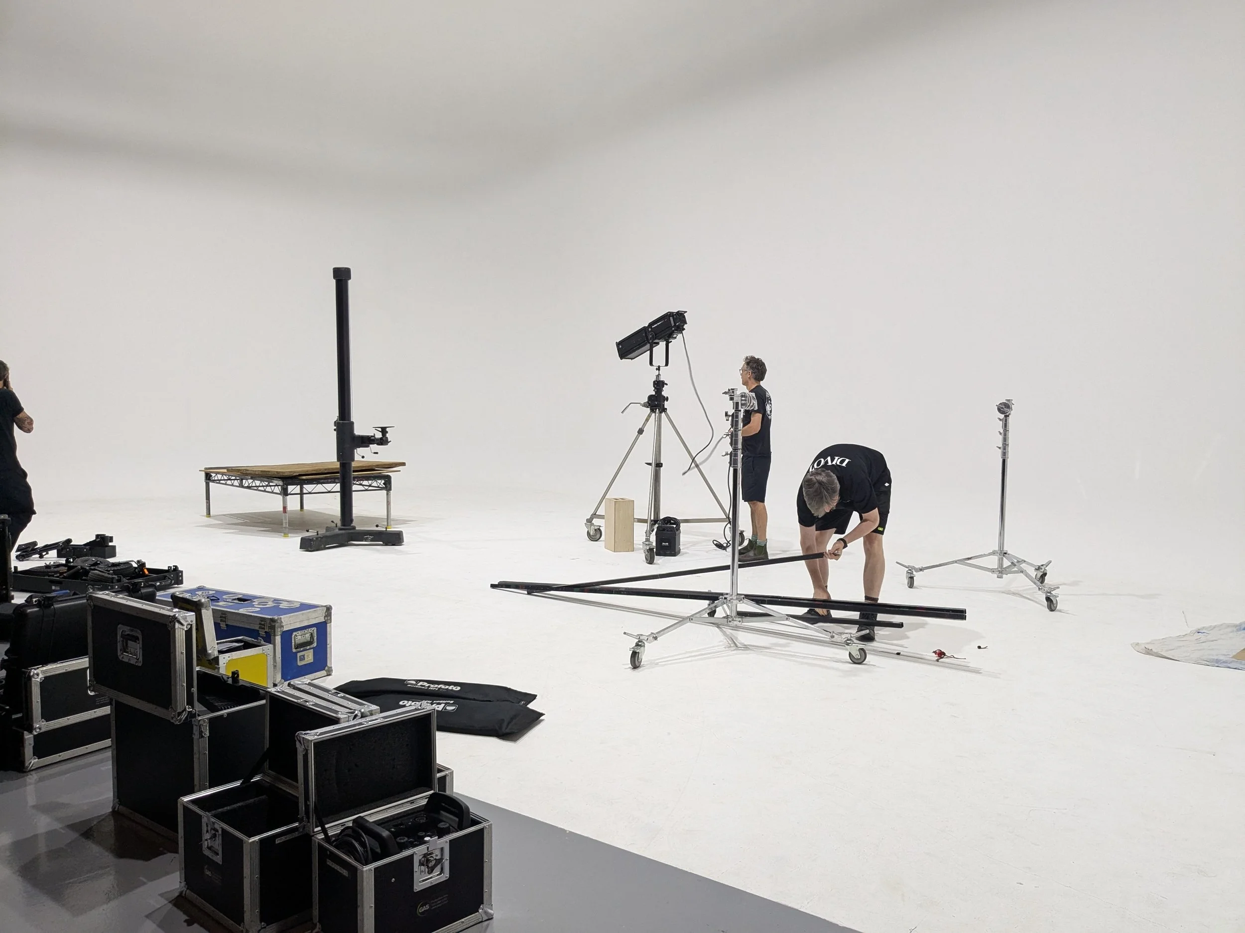
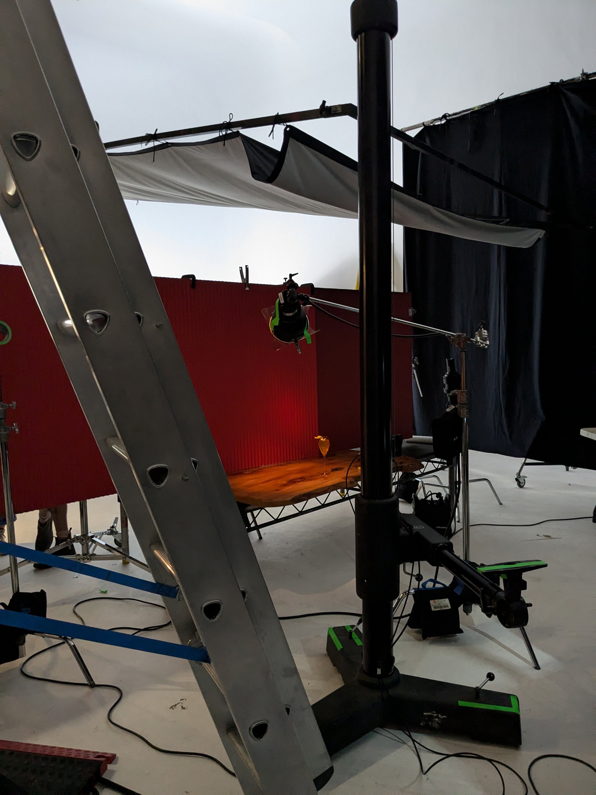
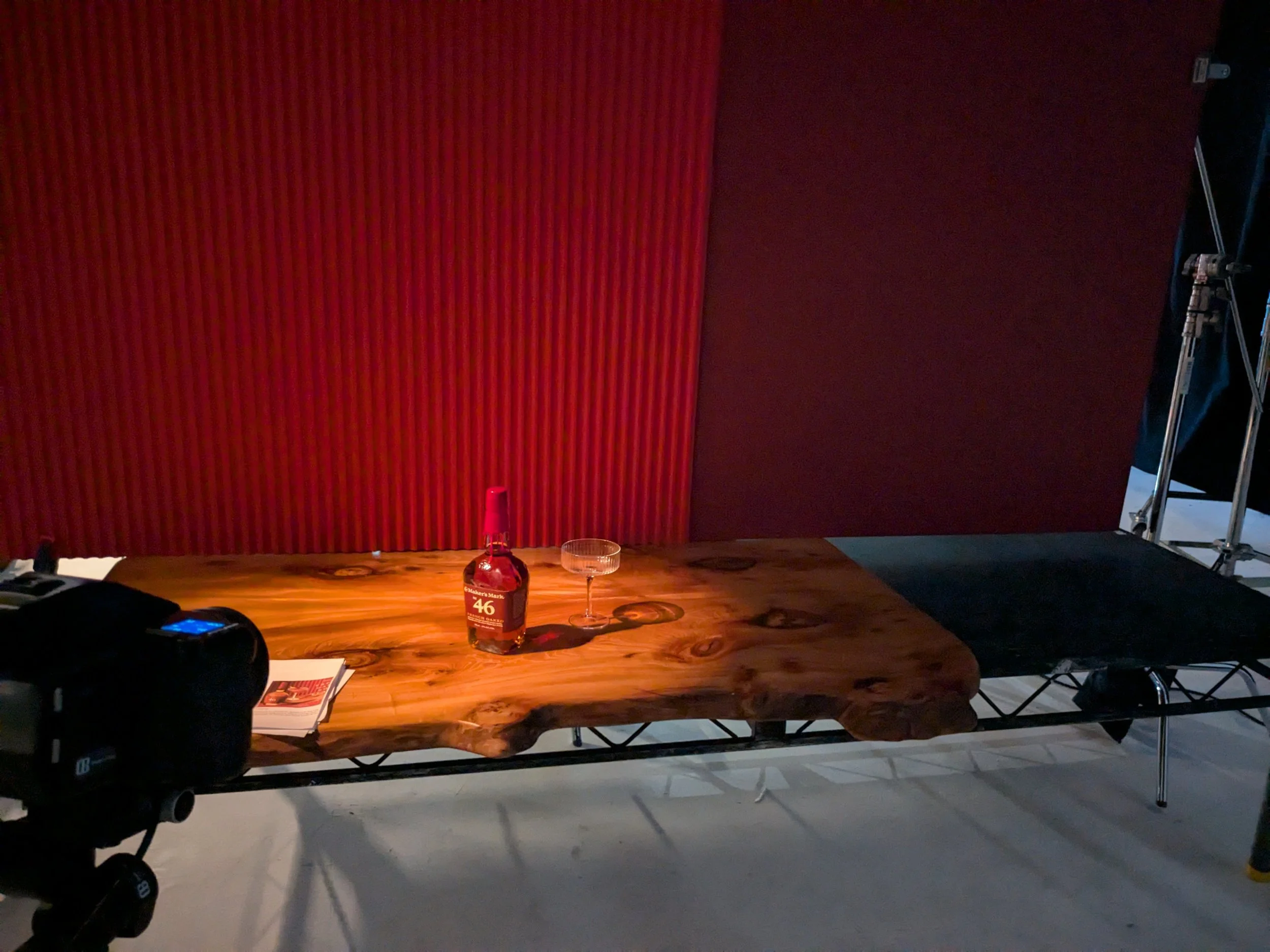
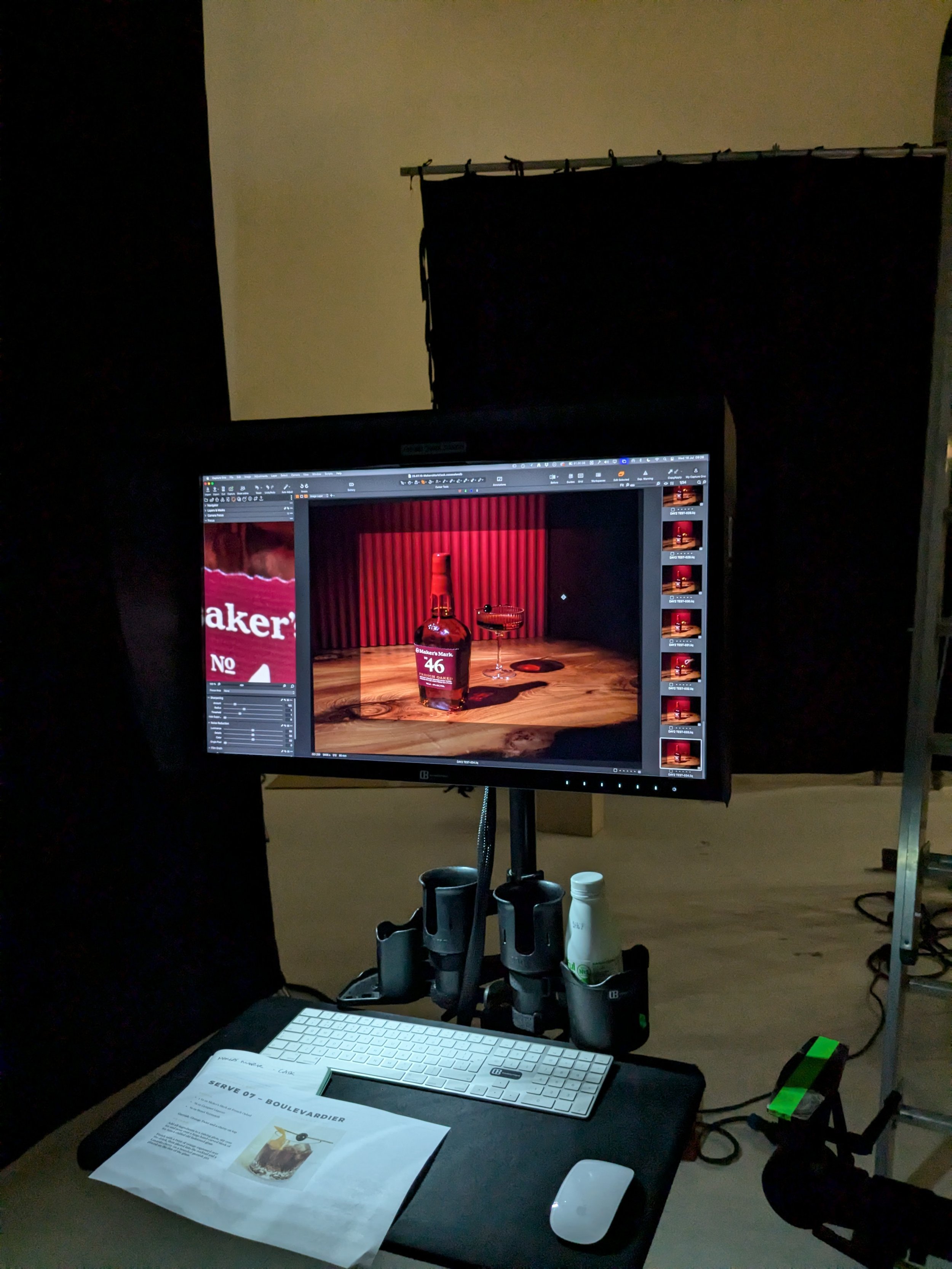
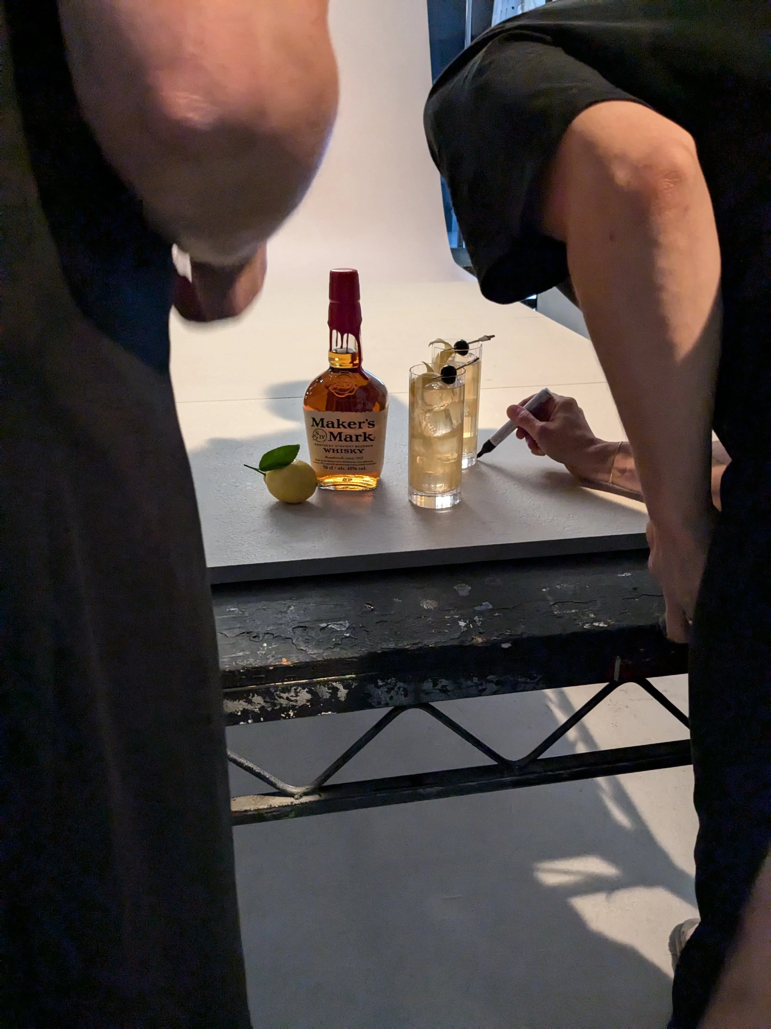
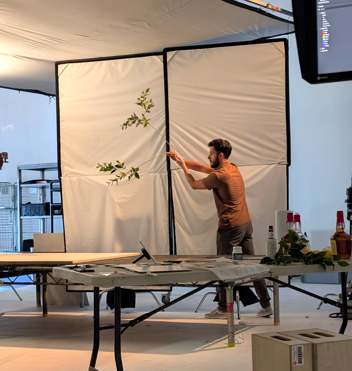
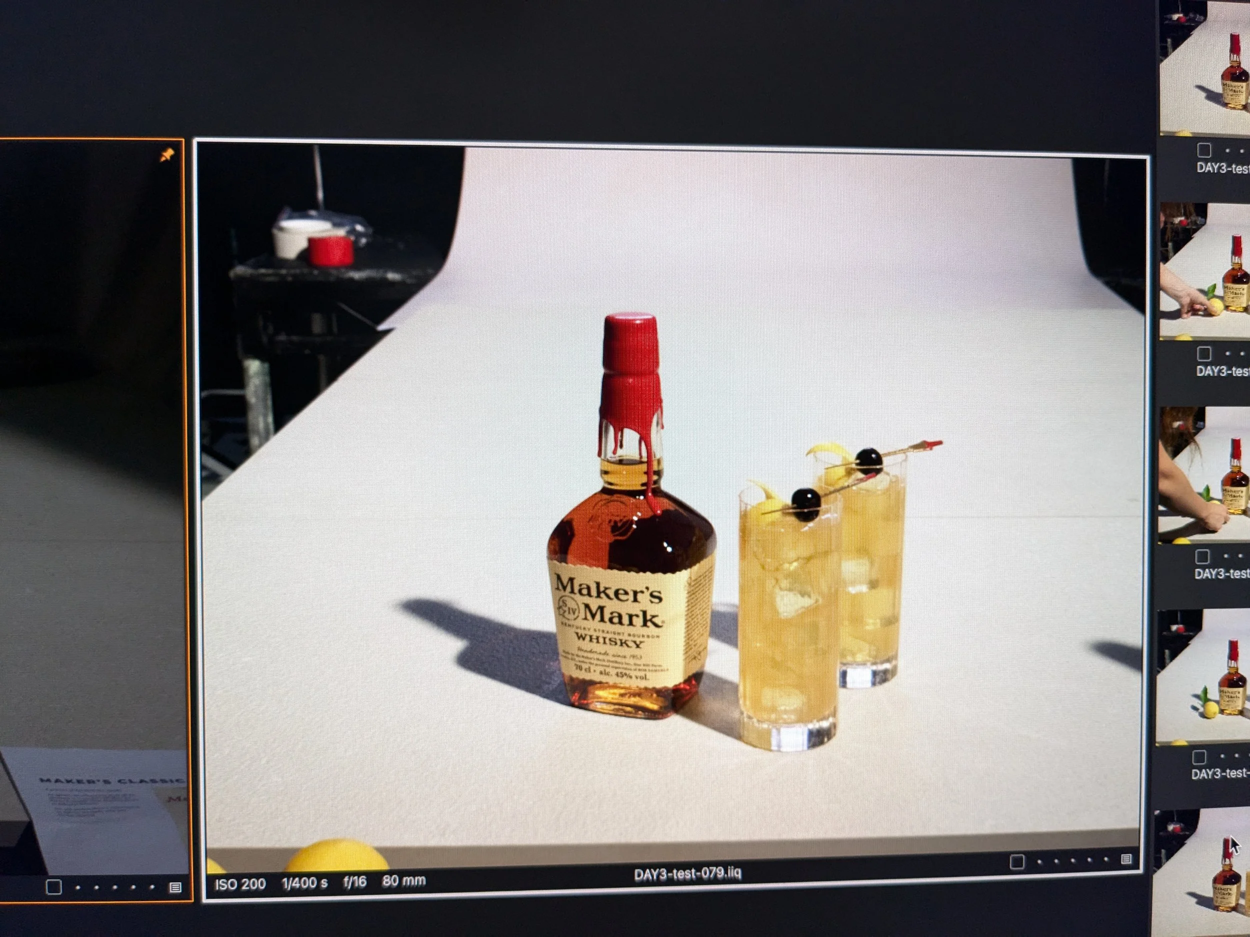
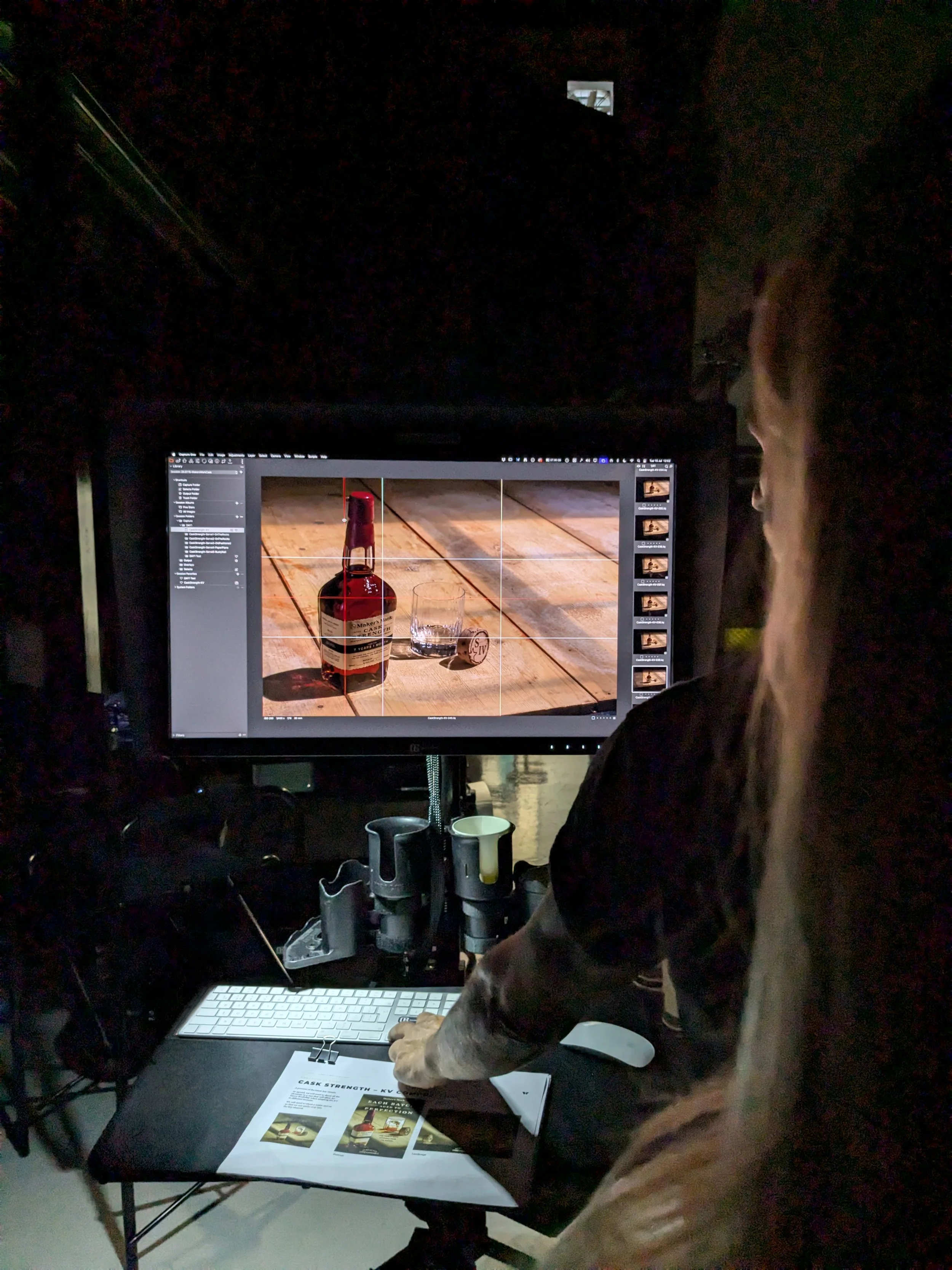
Working closely with the client, strategy, account teams, and photography studio, I oversaw the execution through an intensive three-day production shoot, ensuring the creative vision was carried consistently through to the final assets.
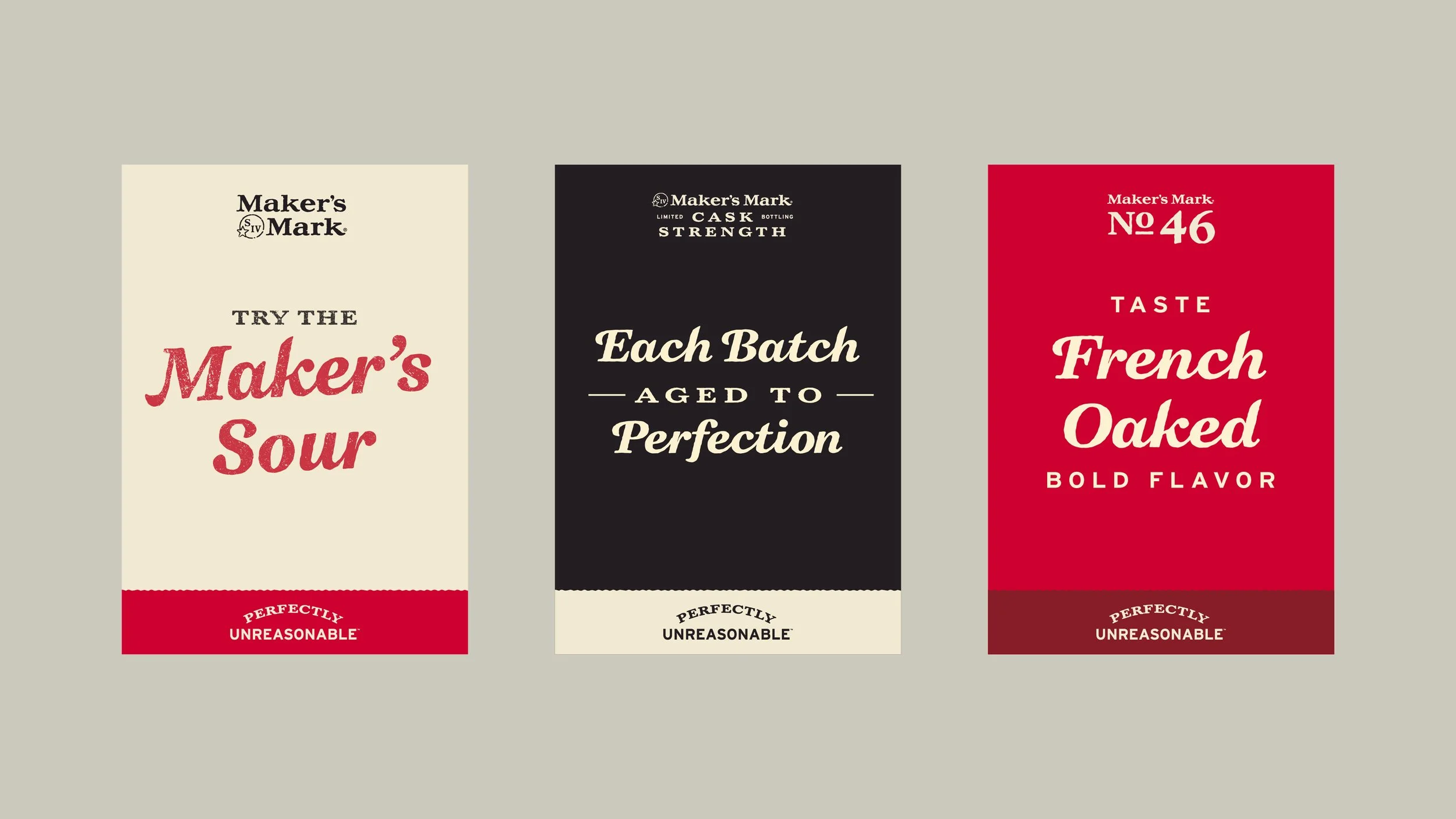
The resulting visual system was rolled out globally across point of sale and retail communications, with the imagery adopted across Maker's Mark's digital channels and continuing to support the brand's evolving identity.
Client: Maker’s Mark | Agency: Wonderworks Communications, Metcalfe Lancaster
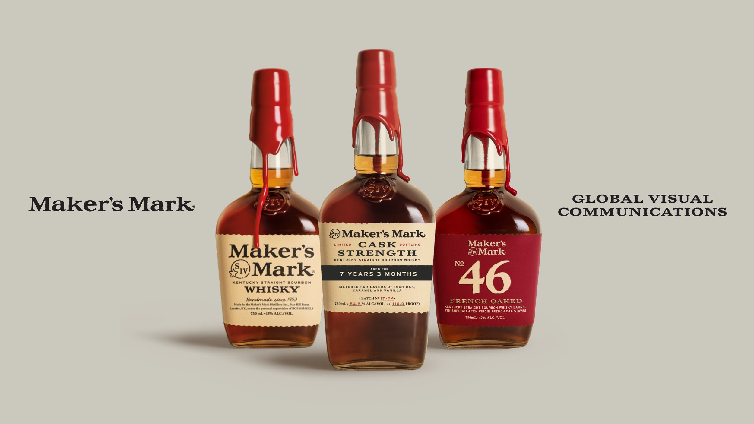
Colour System & Layout principles
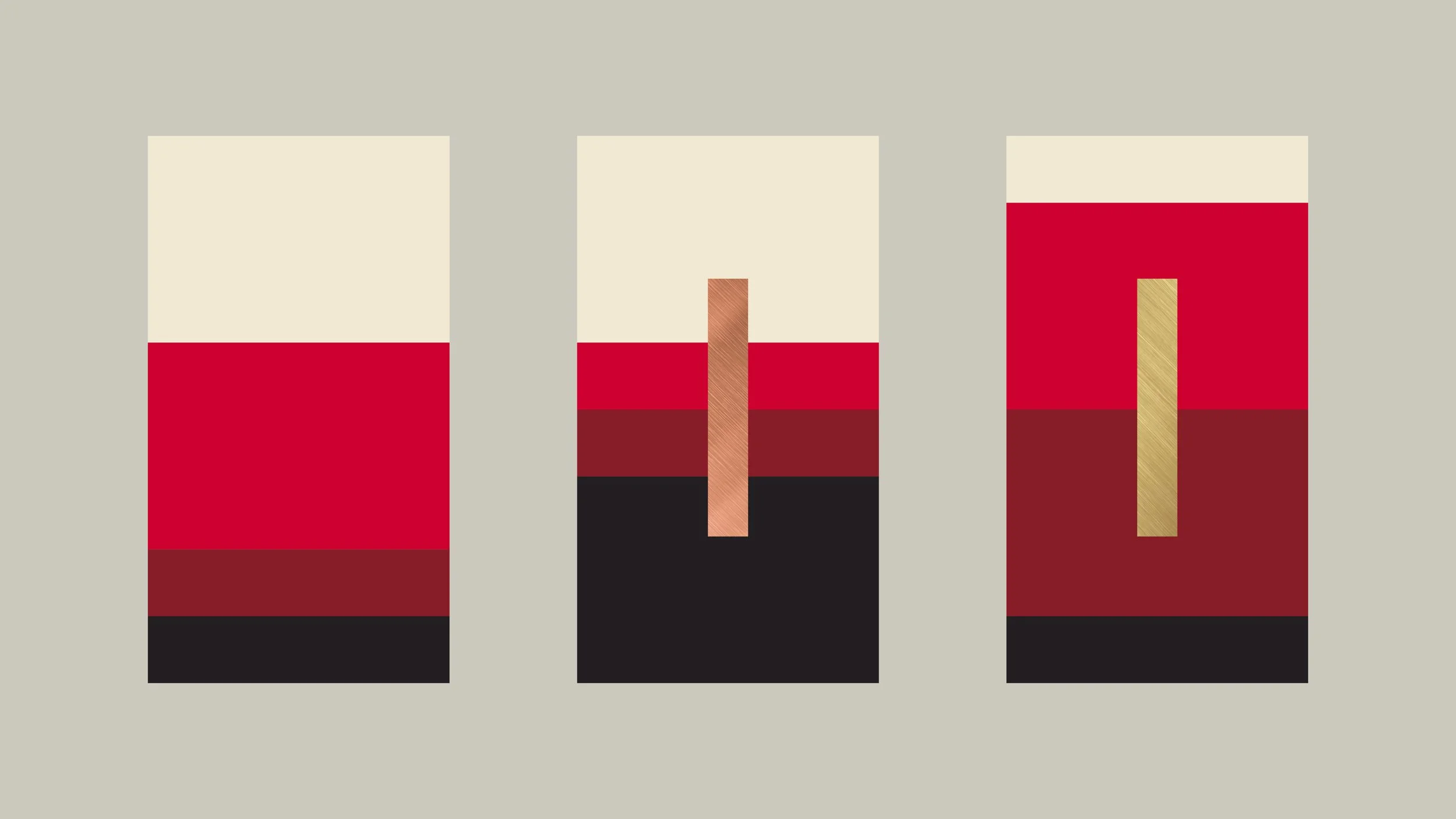
Visual Direction
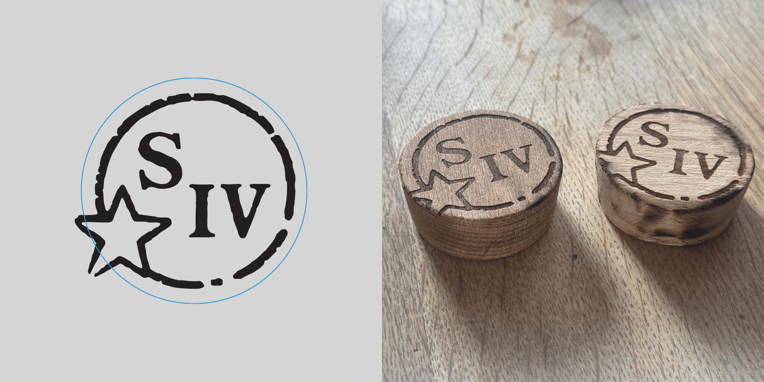
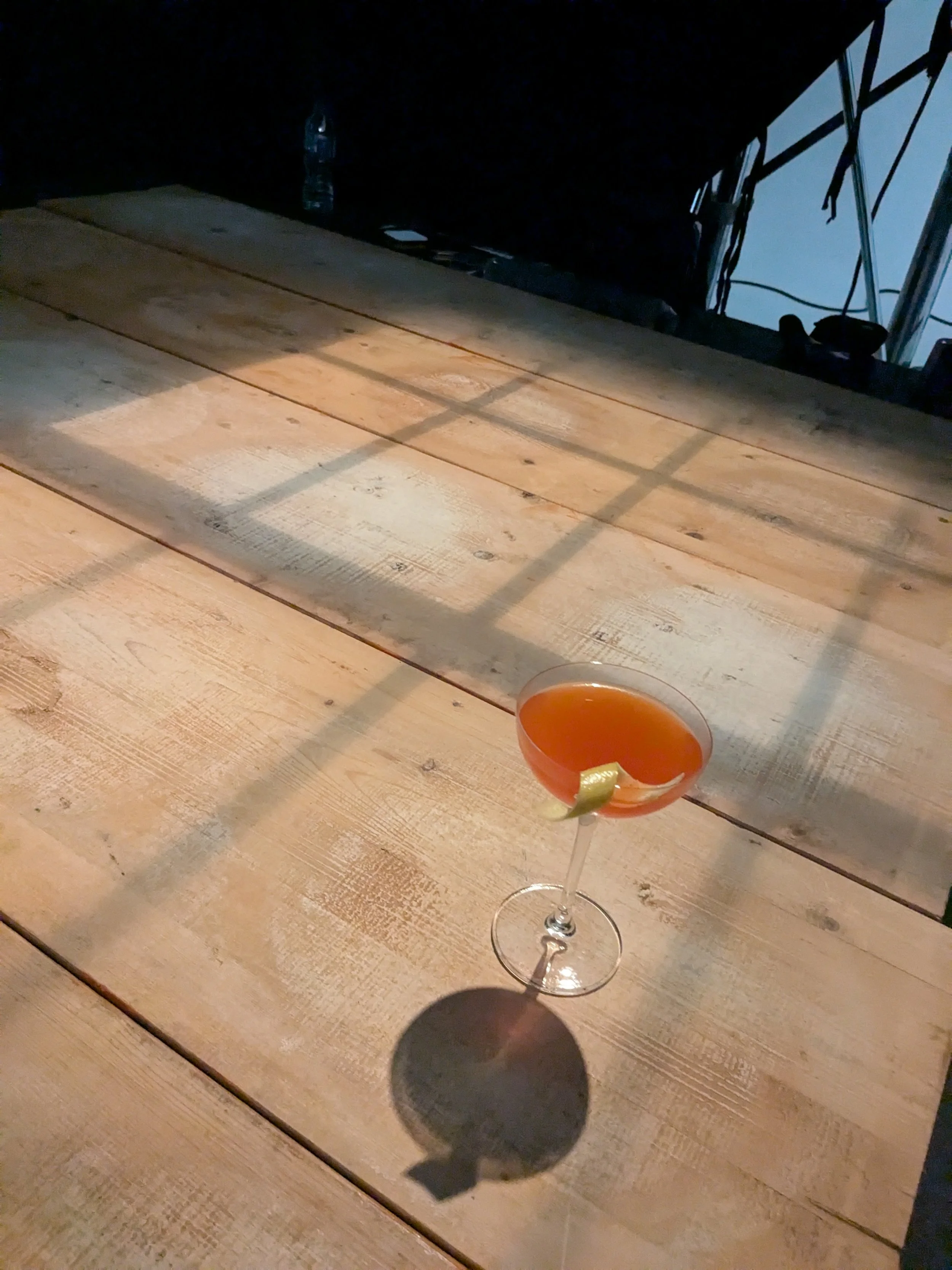
Photoshoot Behind the Scenes
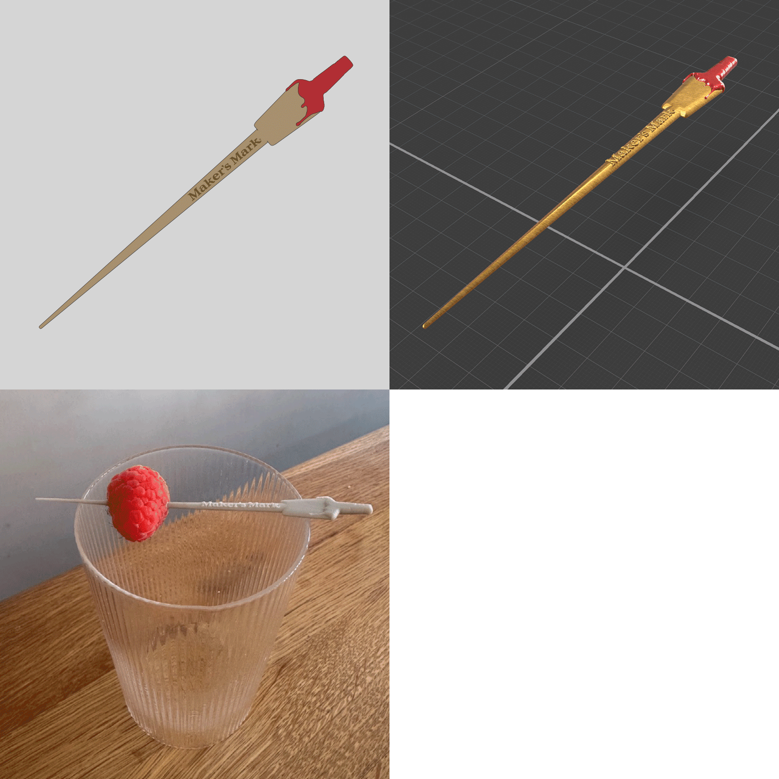
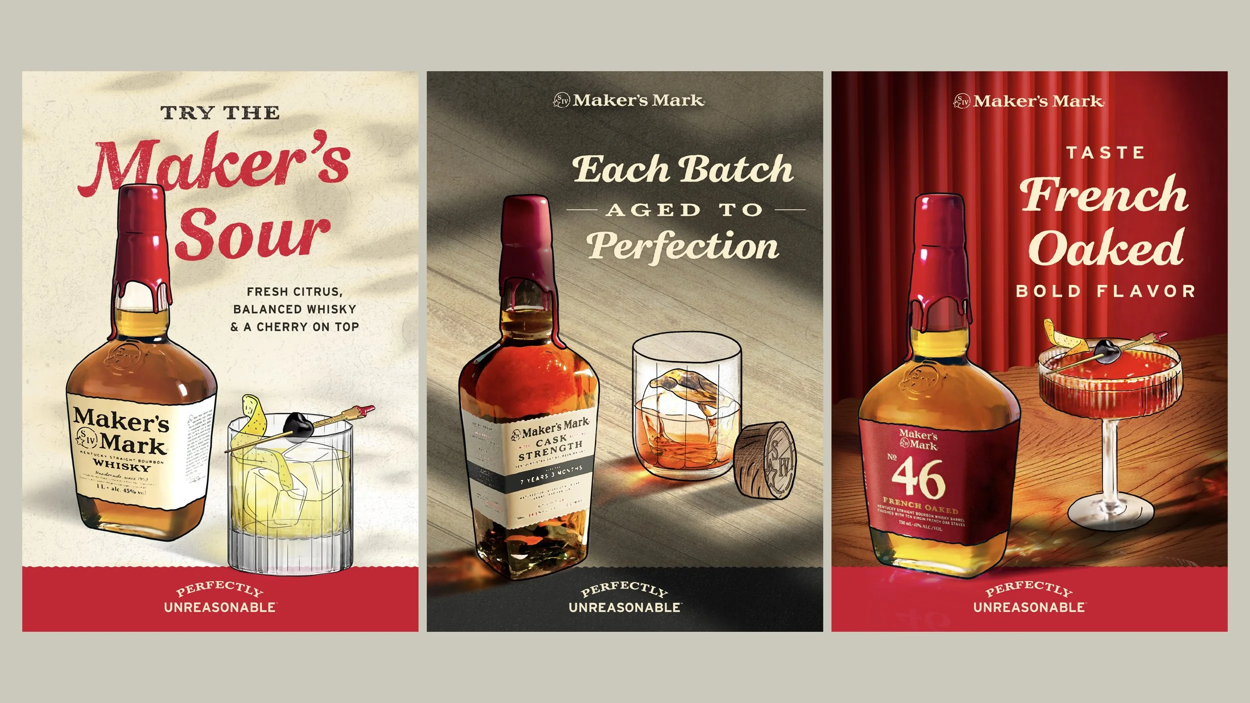
Scamps to Final Artwork
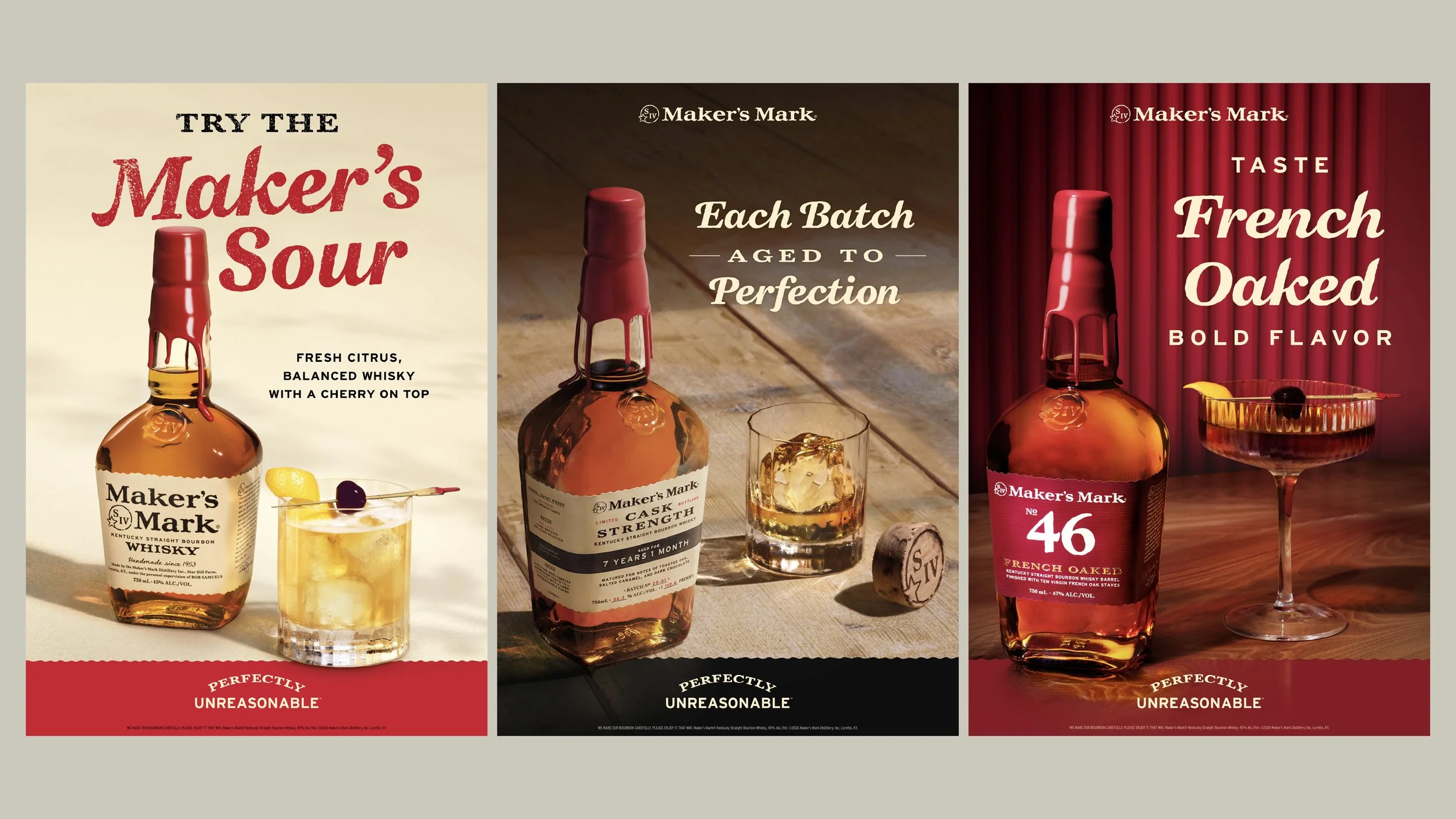
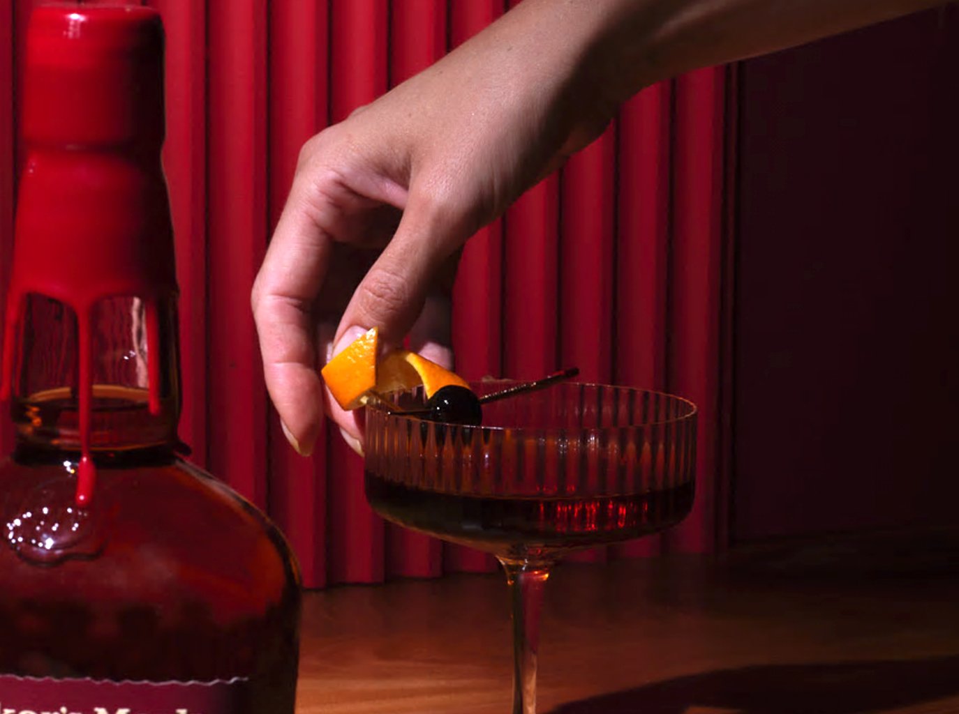
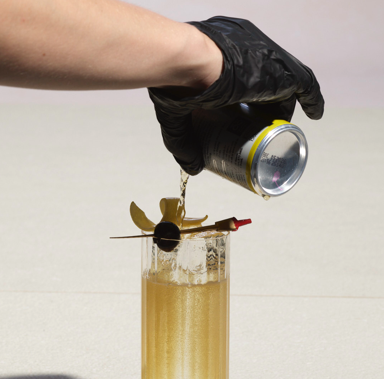
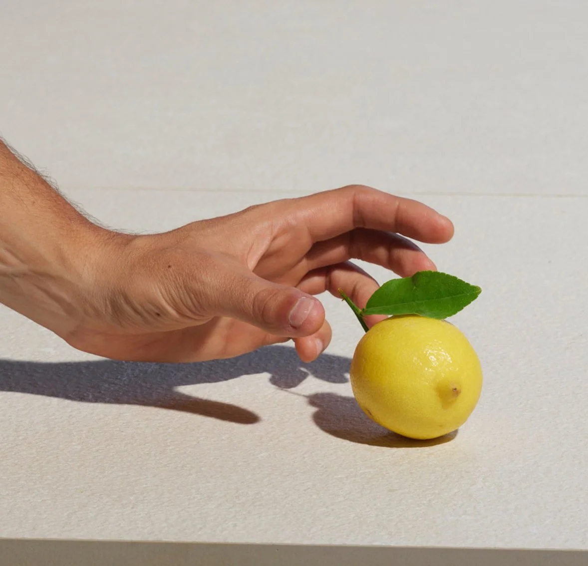
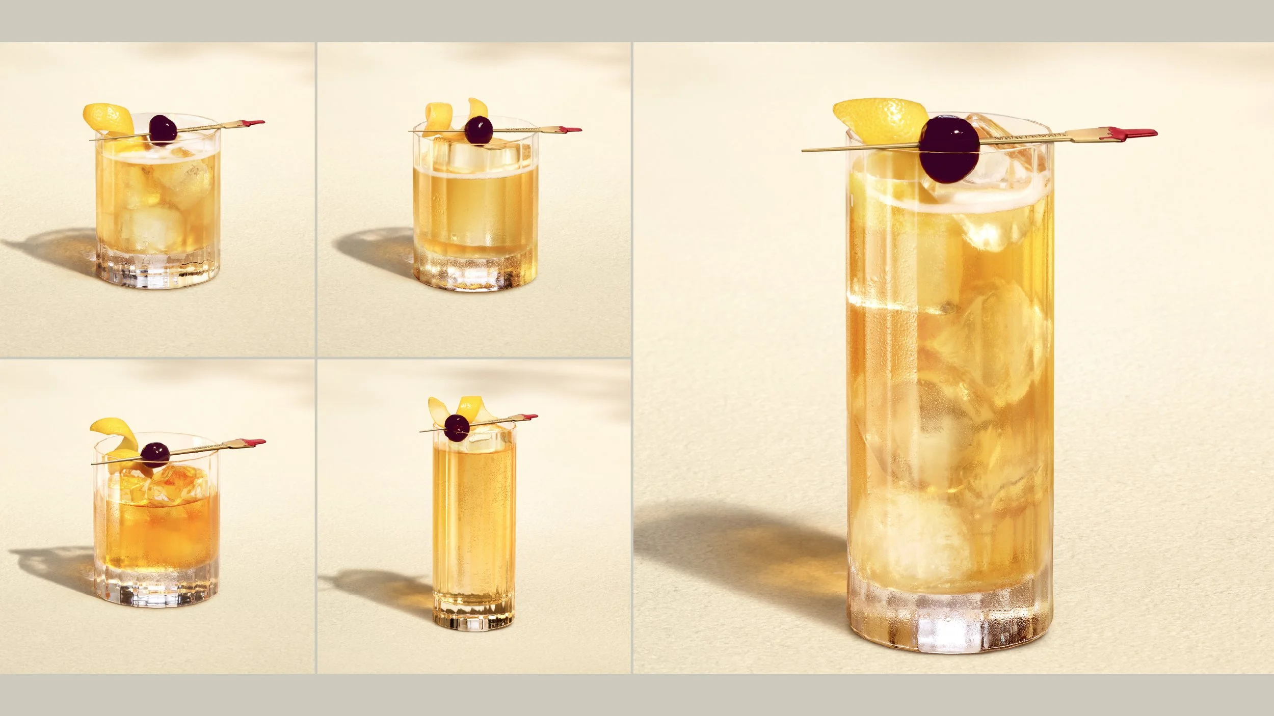
Final Serve Photography
Campaign Applications