This self-initiated project acknowledges Vibram's strong, iconic equities and looks for space to evolve them, beginning with functional problem-solving around legibility and system clarity. From there, the work explores how the identity can change without losing the recognition built over time.
Refining marks, reducing repetition, and aligning the visual language so the brand feels cohesive and future-ready.
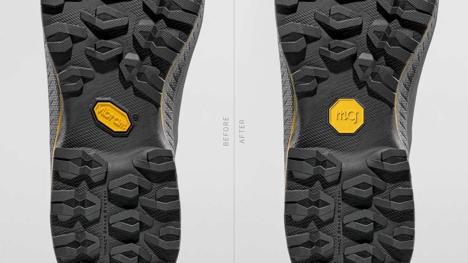
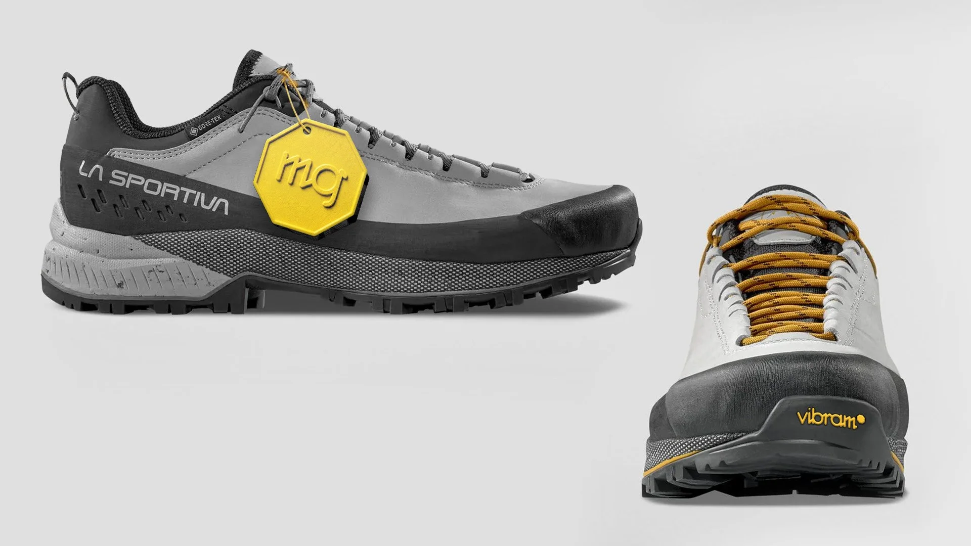
The iconic octagon is refined into a more balanced form, paired with concise compound codes that replace repetitive markings.
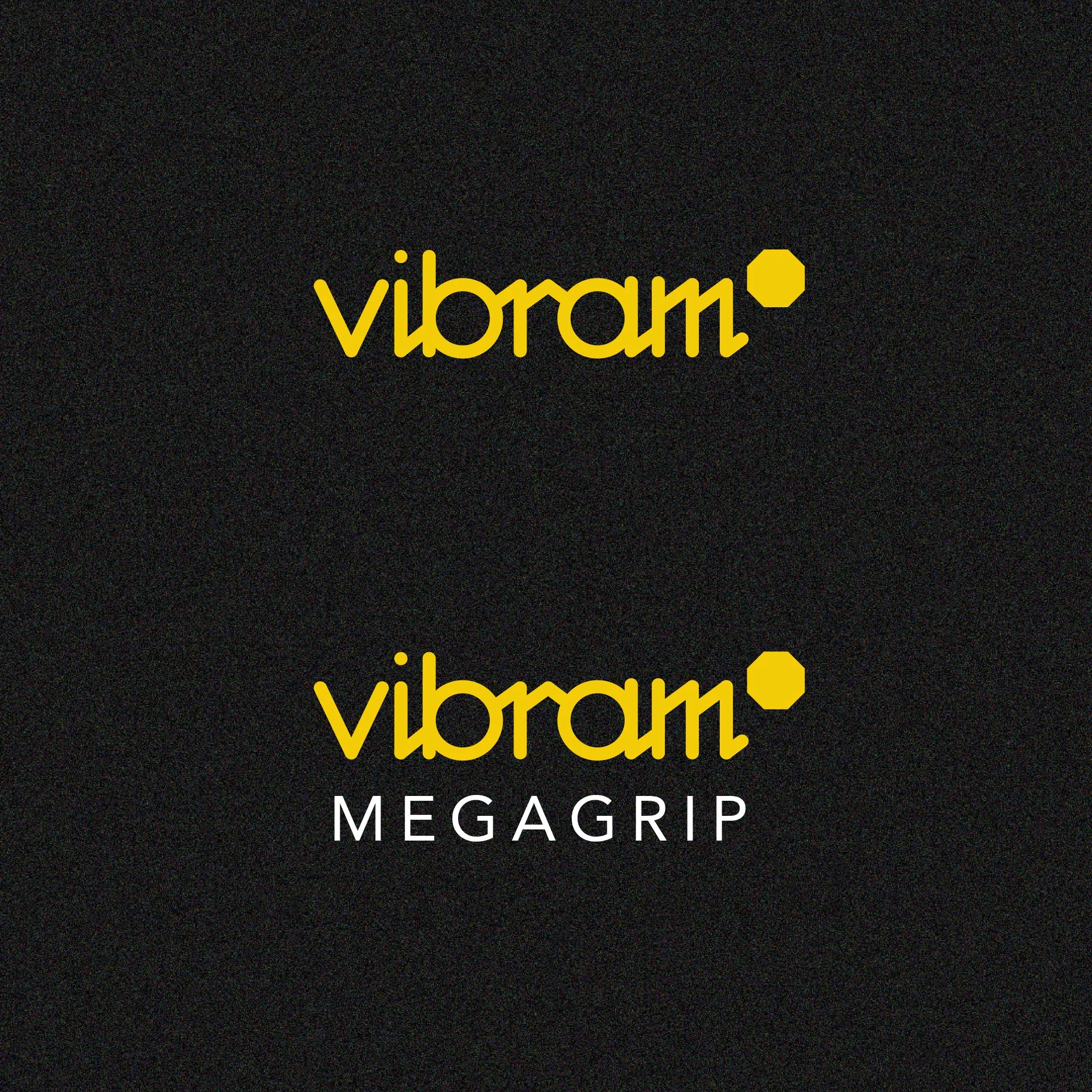
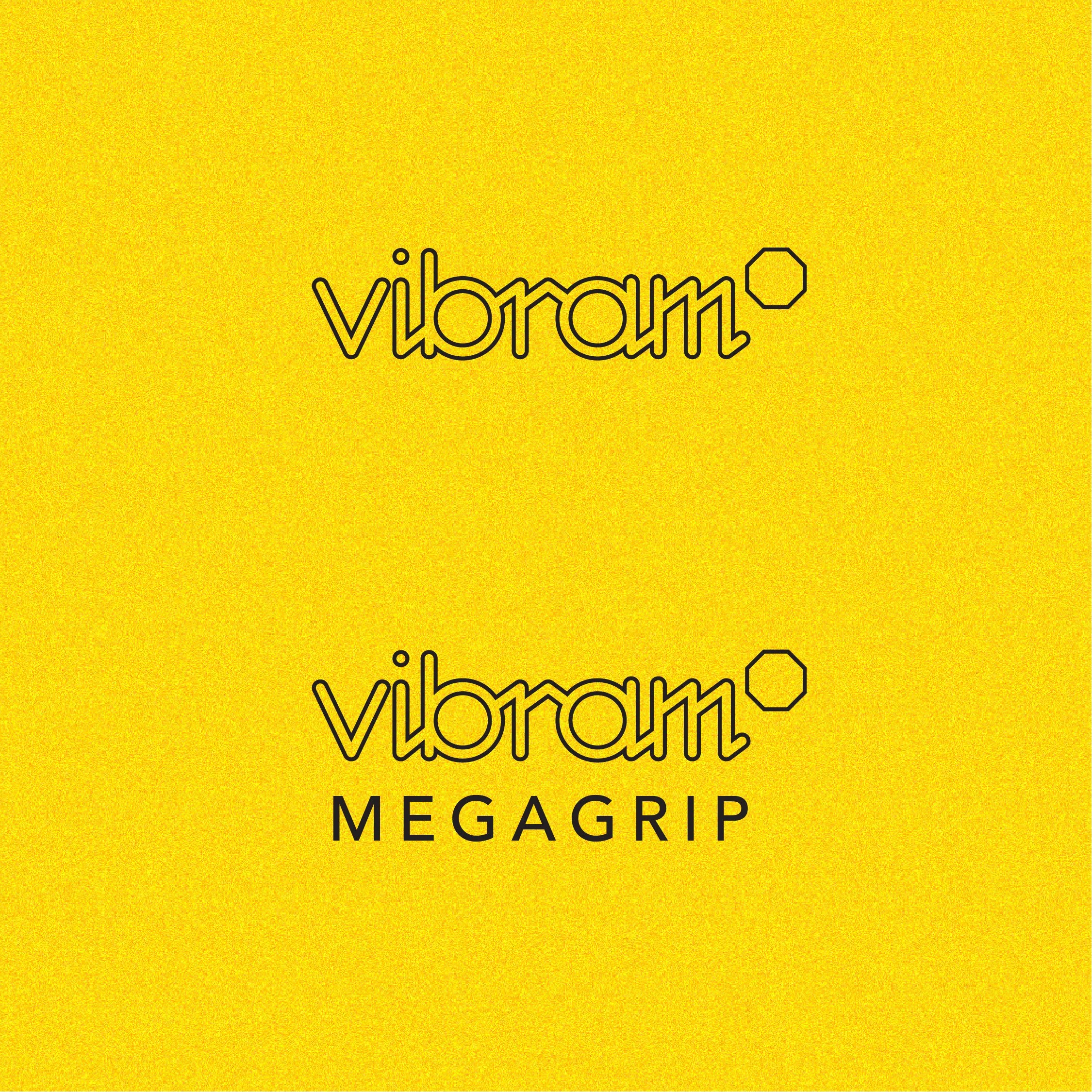
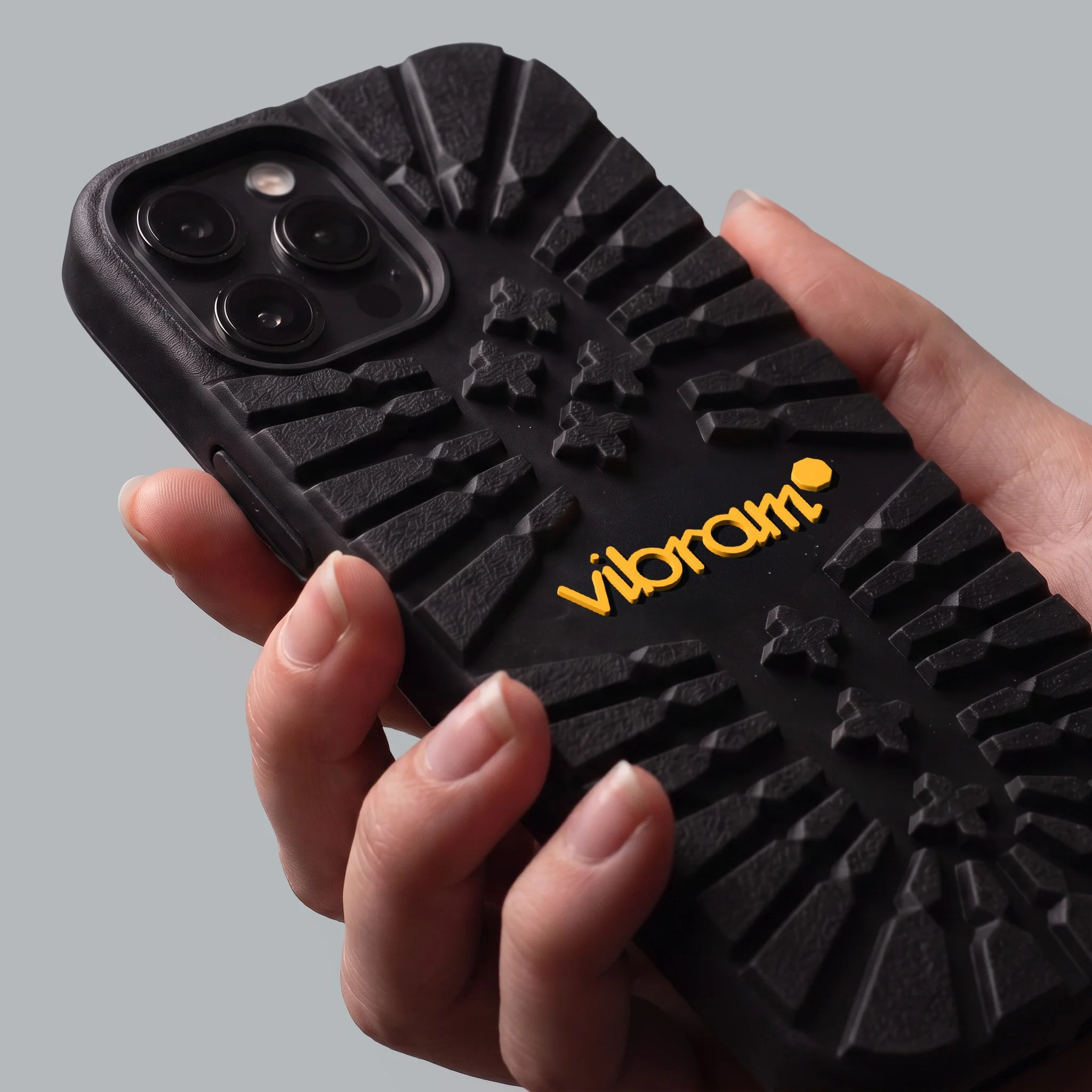
A custom typeface, inspired by the founder and acclaimed alpinist Vitale Bramani's signature, ties heritage to function.
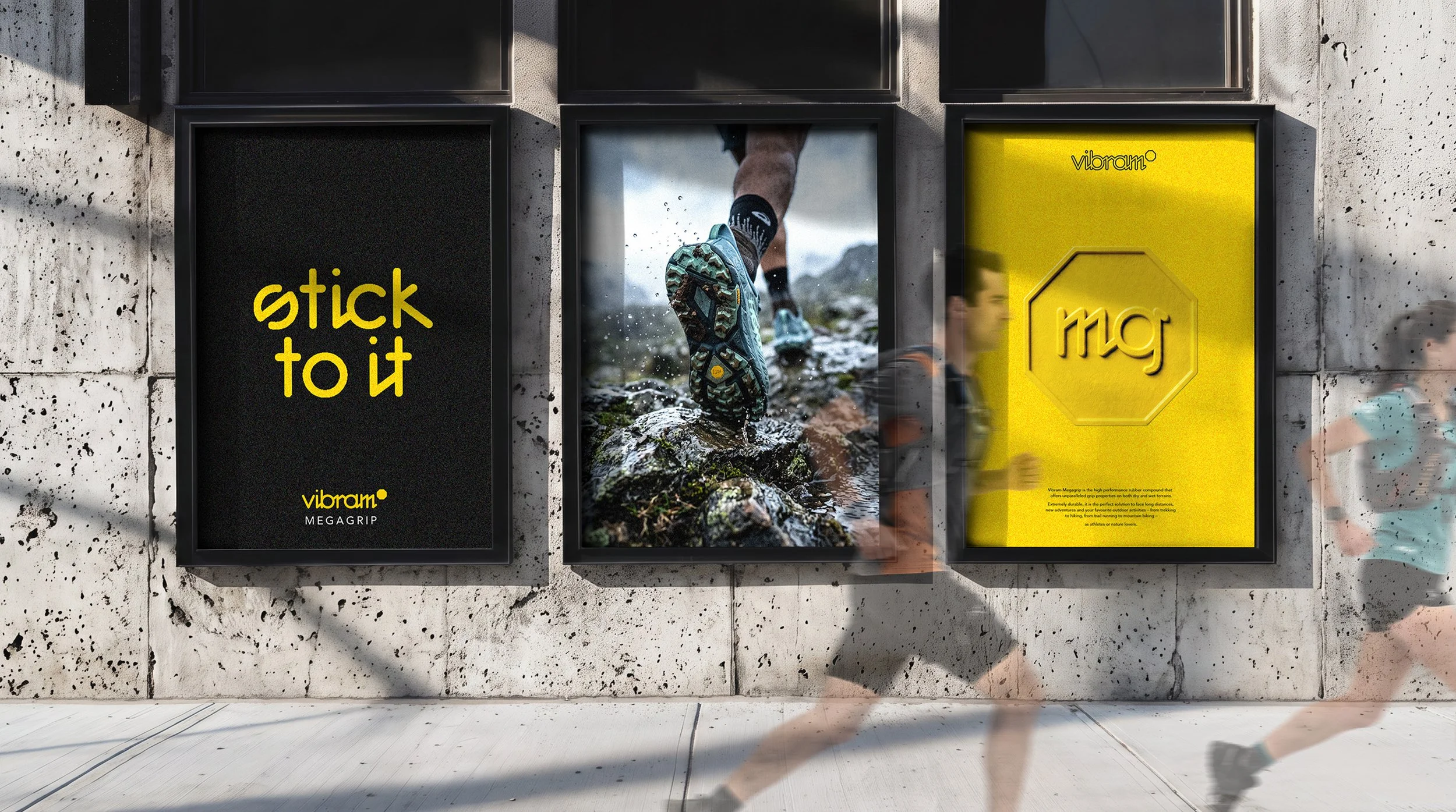
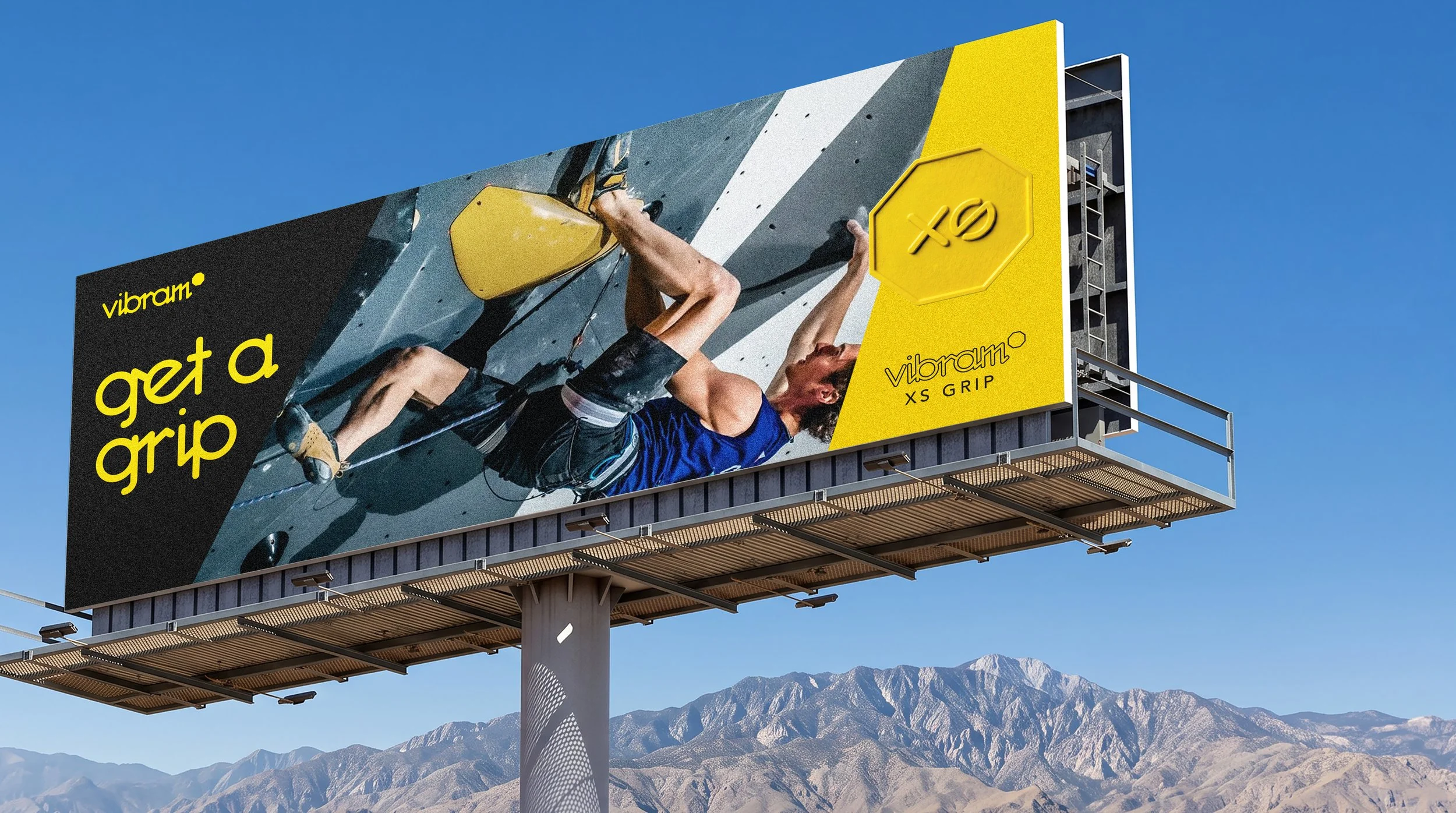
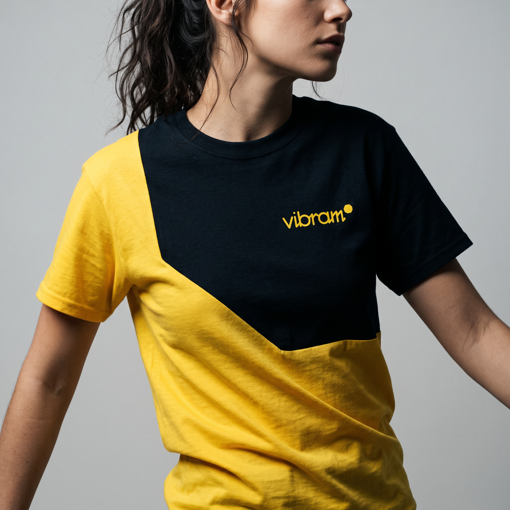
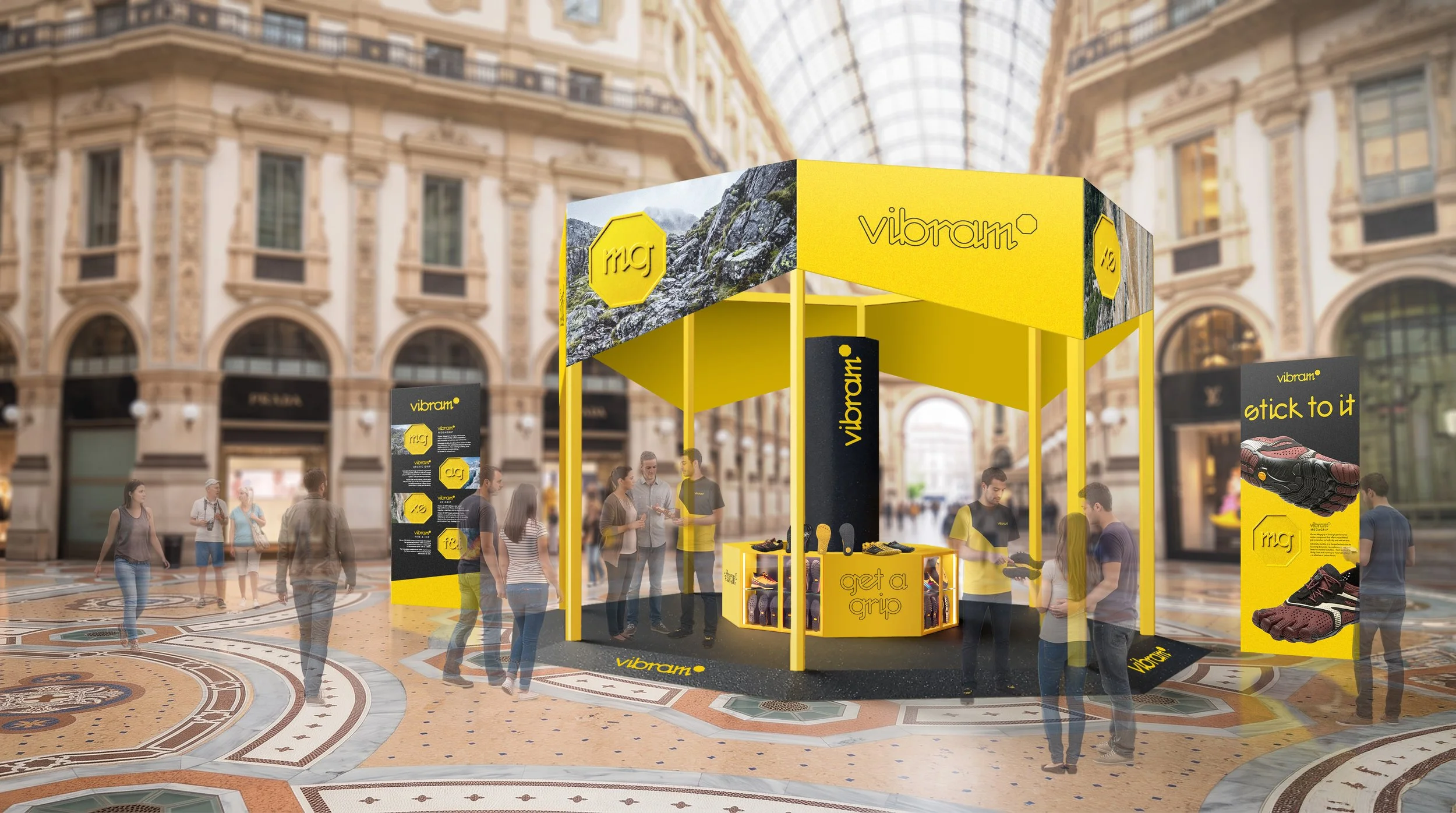
The system extends across soles, lateral marks, tags, and merch, plus campaign concepts that demonstrate the new typographic voice. It culminates in an activation idea set within the core of Milan's Galleria Vittorio Emanuele II - the original inspiration behind the octagonal shape - linking brand history with a contemporary audience experience.
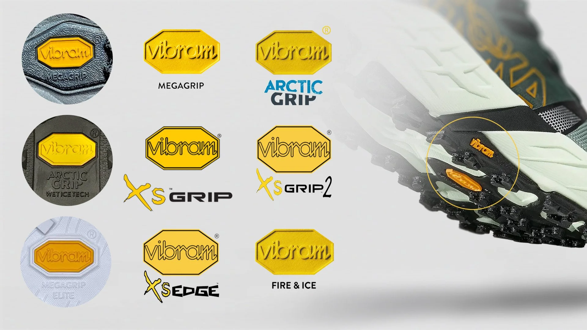
Current Branding System and On-Shoe Application
New Wordmark Adaptation and Typeface Design
New System Application On Product

Campaign Concepts
Merch and Activation Concepts
For this self-initiated portfolio project, Vibram, La Sportiva, HOKA and Adam Ondra's trademarks, brand identities, and name and likeness belong to their respective owners, with no endorsement or affiliation.